
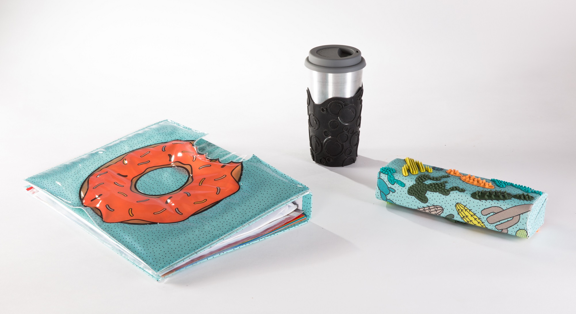
Itchie is a set of 3 everyday objects.
Design for all teens,
But at first it was designed thinking of
teenagers with Sensory Processing Disorder.
My Role
Research, Design, UX, User testing
Familiar with the feeling of a bothersome seam in a shirt or prickly wool knit?
This is how someone who suffers from SPD feels – throughout the day, every day.

SPD is a congenital neurological disorder.
It impairs normal daily functioning.
Dealing with the disorder is anew every day.

SPD expressed difficulty in the absorption
and processing of the five senses, usually appear
as hypersensitivity or under sensitivity.

SPD is very common among the population.
However, there is a tendency for a lack of an orderly
diagnosis, and accordingly, proper treatment in time.

SPD is a congenital neurological disorder.
It impairs normal daily functioning.
Dealing with the disorder is anew every day.

Itchie offers several external stimulus options that are absorbed into the everyday environment – pencil case, binder, and drinking cup.
All 3 products can be used to stimulate or calm according to the user’s need.

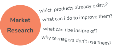
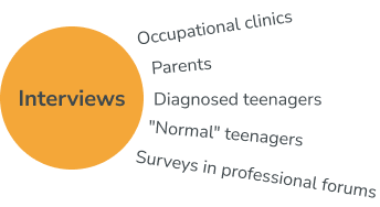
While working on “Itchie”, I used a number of research methods, both in the academic and professional field and in the field of user experience.
In every field I asked many questions, the answers helped me to formulate an idea about the product I want to design.
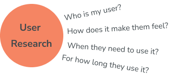

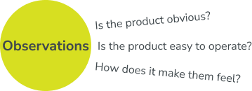

Main conclusions from the research process:
The User:
Teenagers
does not receive a
therapeutic response.
The Product:
Not another
dedicated product
The market is flooded with dedicated products that are used for a short time.
The Look:
Mature look
Mostly, these products are with a childish look and identified for treatment – labeling the user.

In this section, I will present the main milestone of the design process.
Each object underwent several rounds of mockups and precision
until I reached the final product.
Pencil case

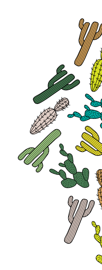
A pencil case covered with various textures provides a solution for tactical search.
The pencil case can be opened at a 180-degree allowing the arm placed in a socket, which increases the body’s contact surface area with the pencil case.
Model #1 focused on:
Proportions and measurements –
ergonomics, similar products
Texture – which texture and why
Overall look and feel

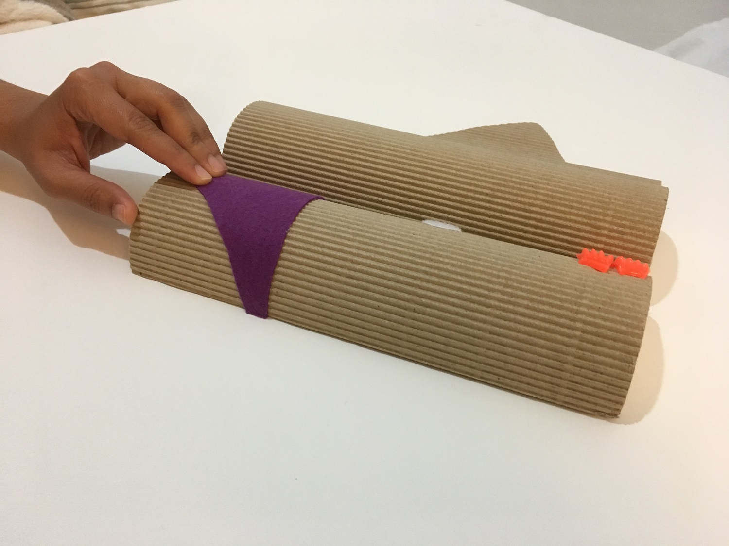
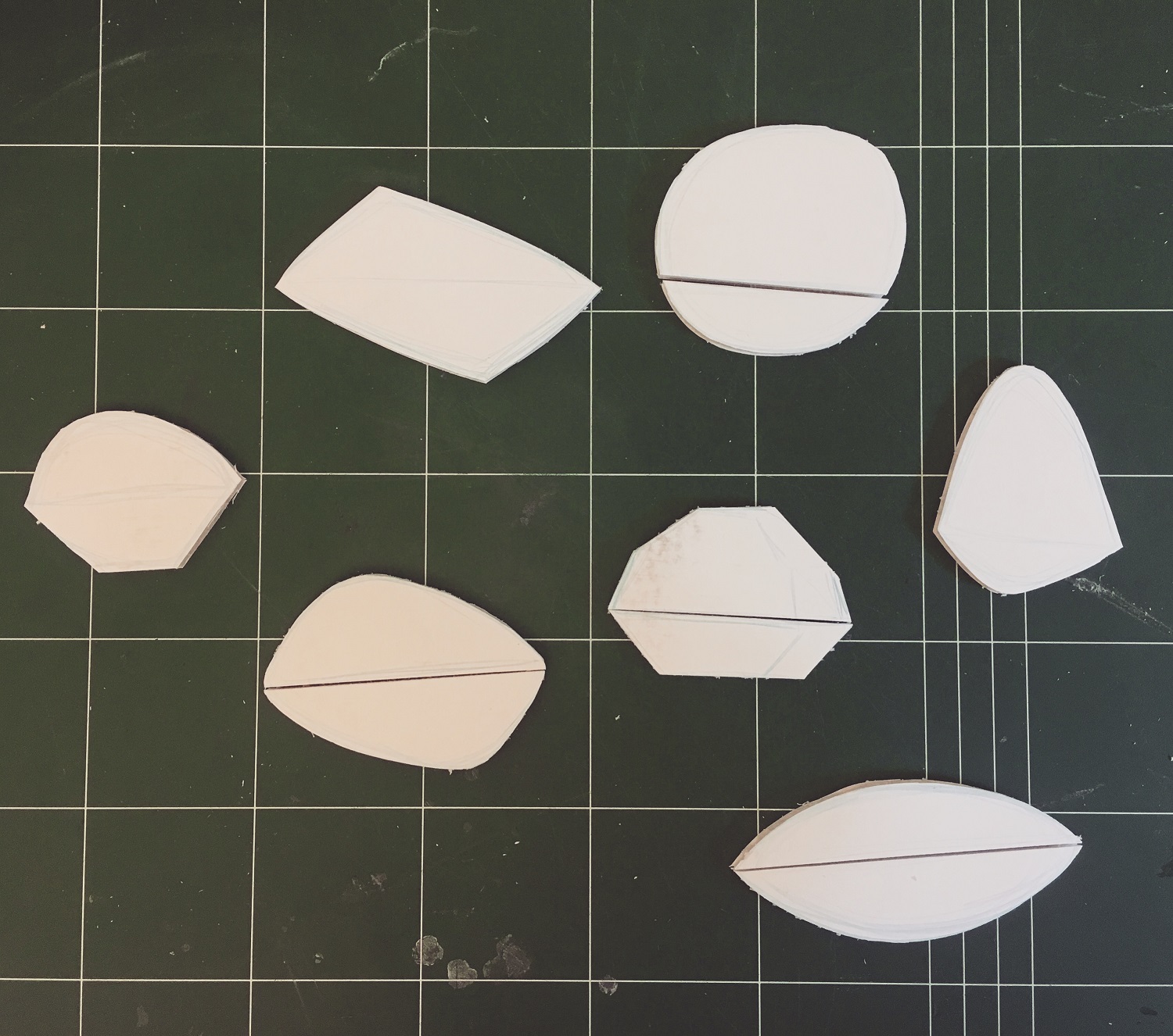
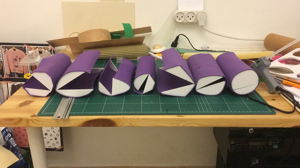
Next step – mockups:
Precise the shape
Examines the size
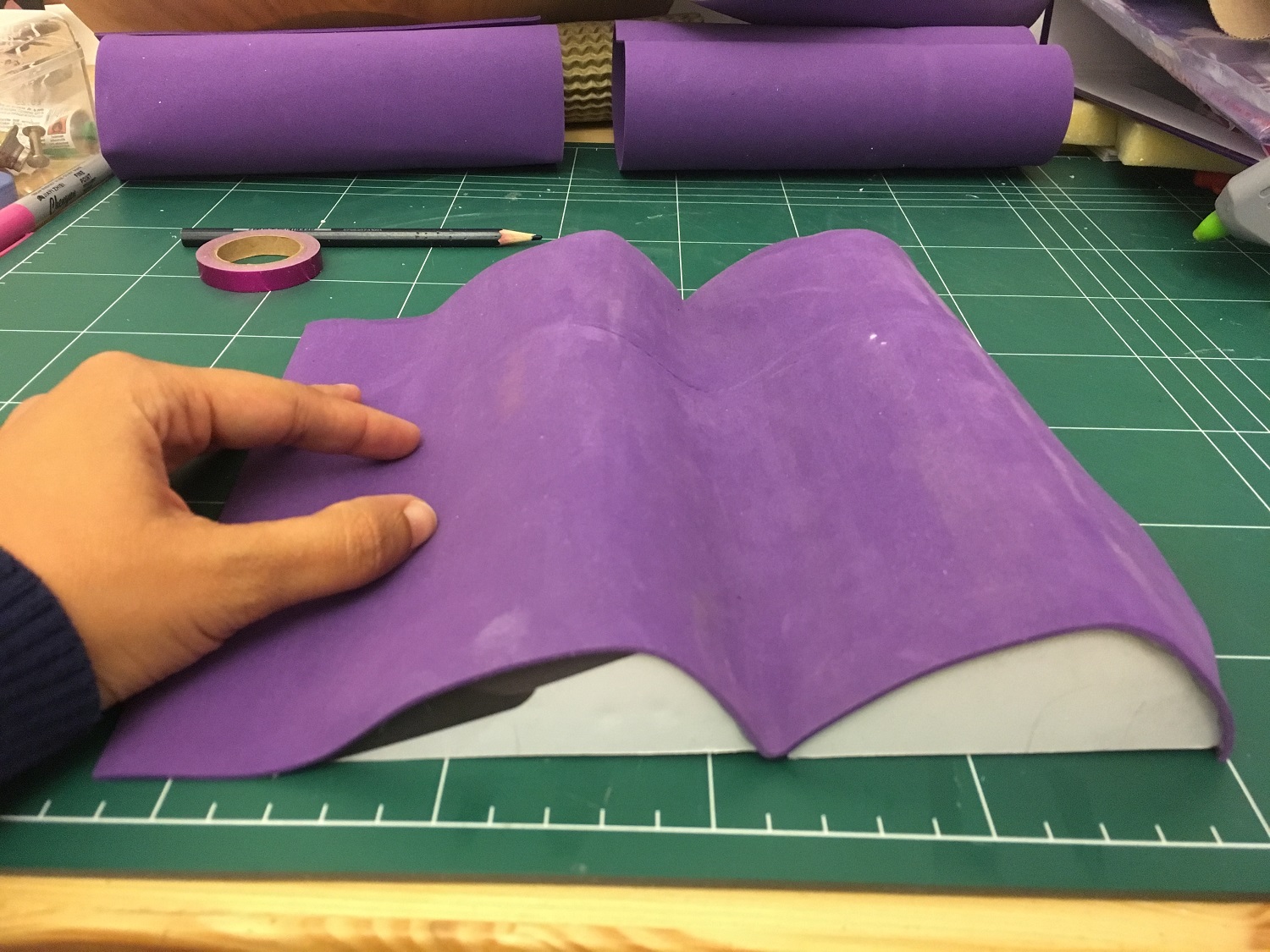
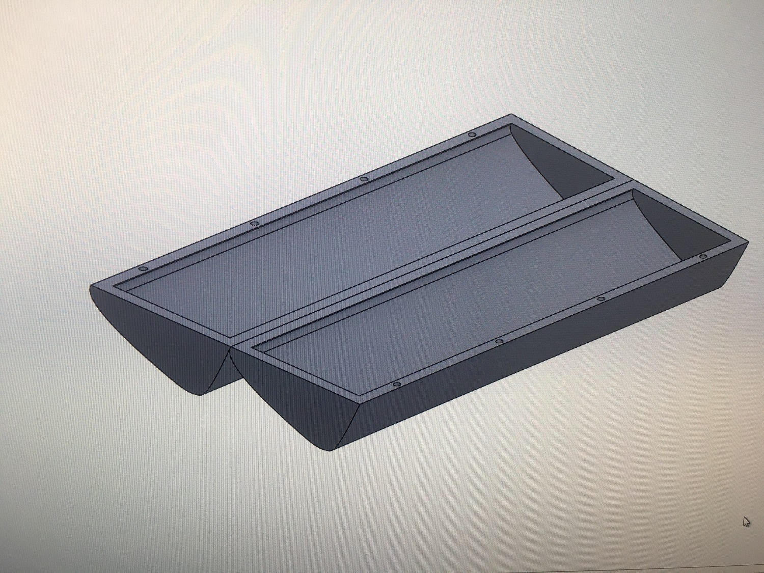
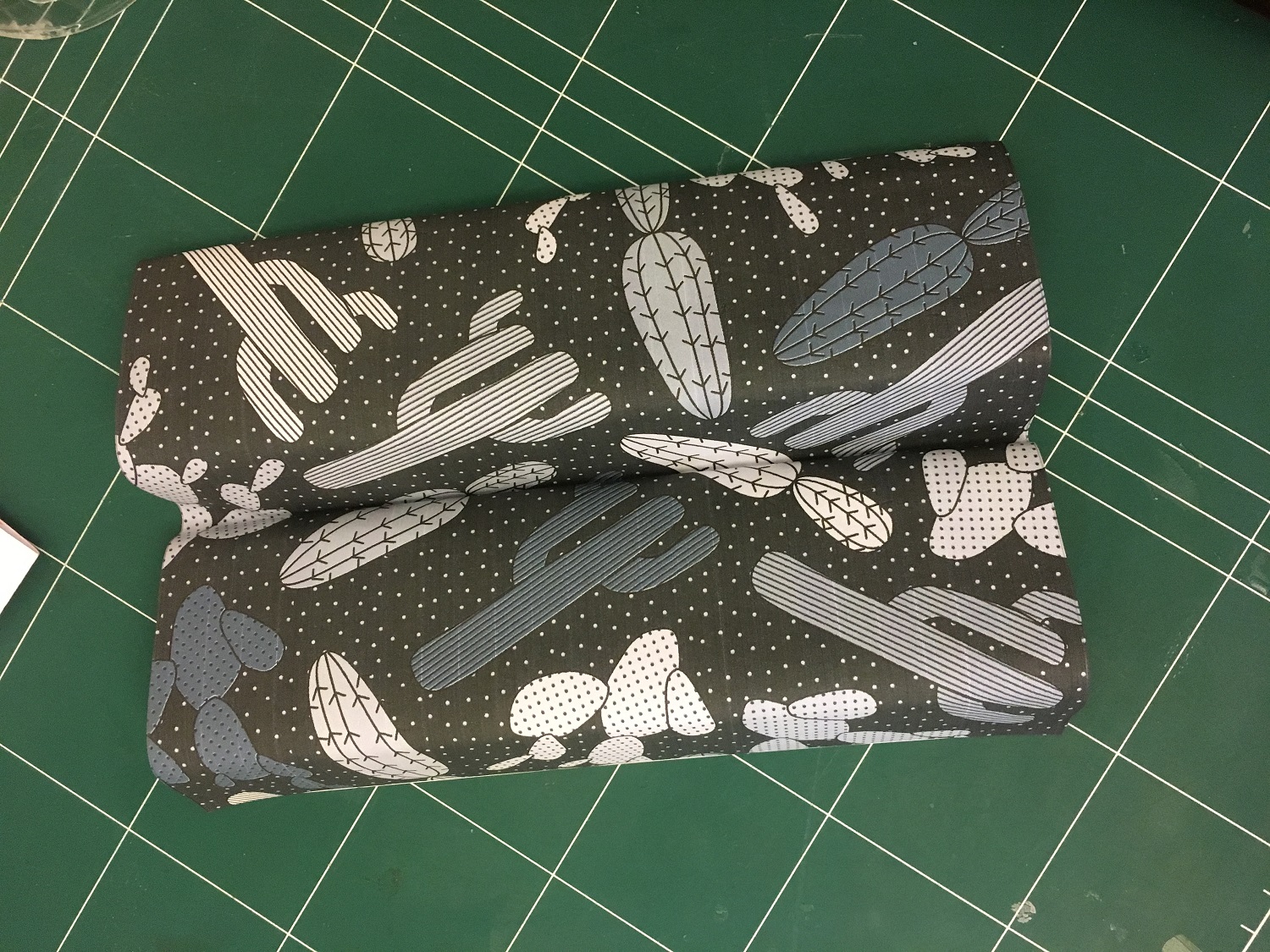
Model #2:
Selecting the final shape
Design 3D prototype
Start working on details

Binder

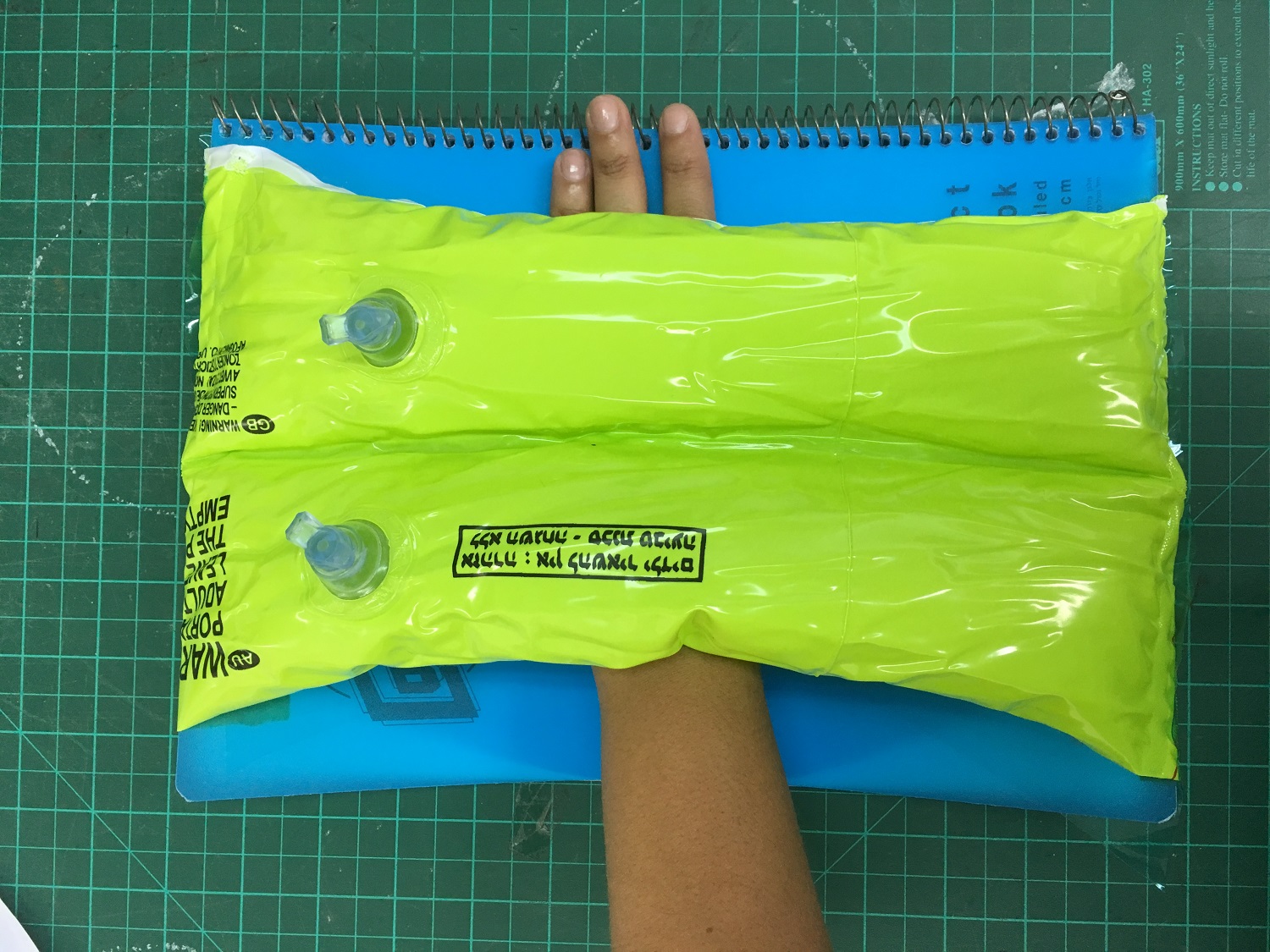
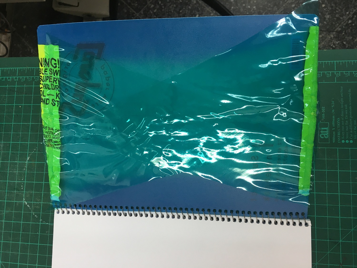
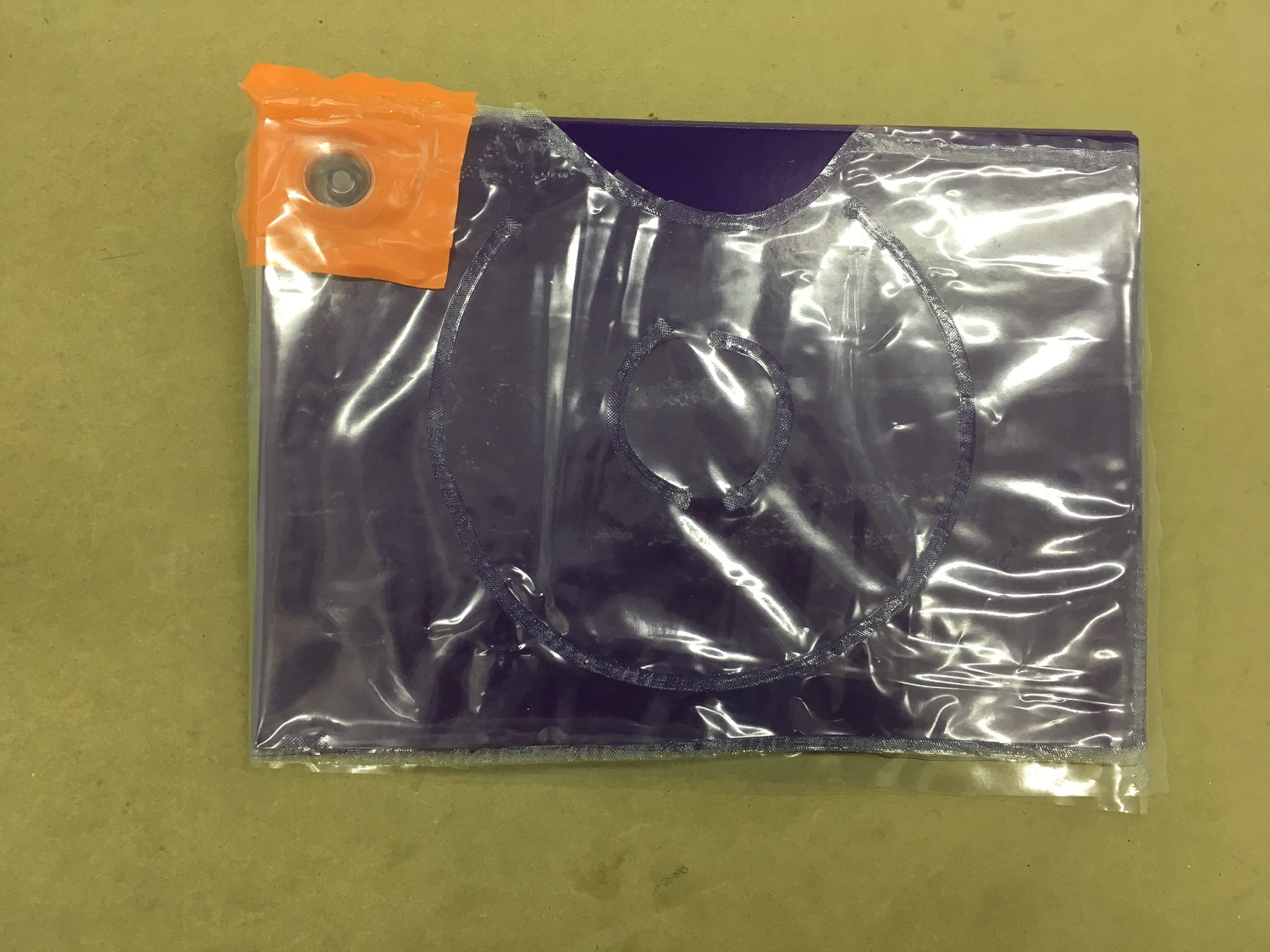
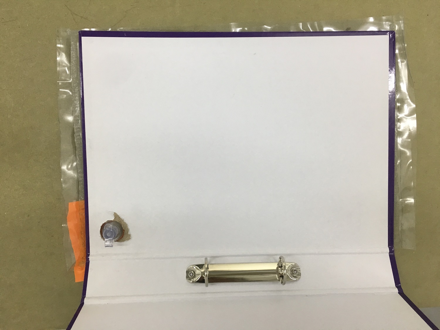
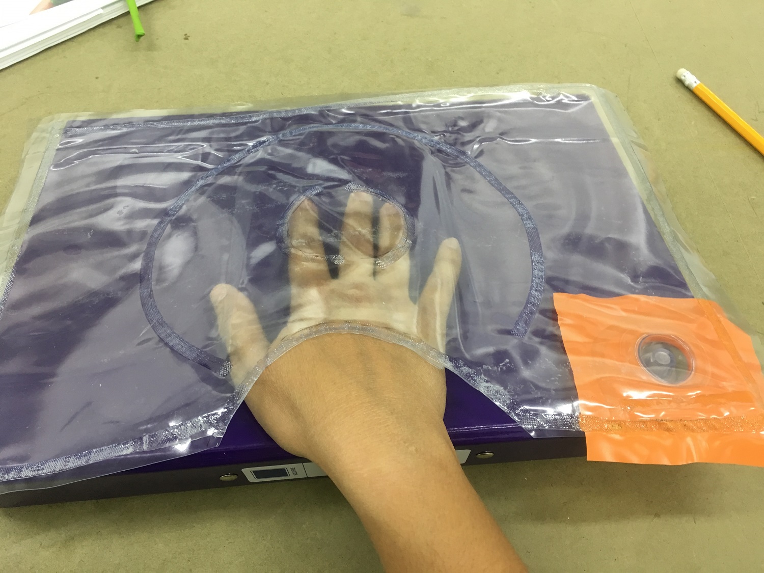
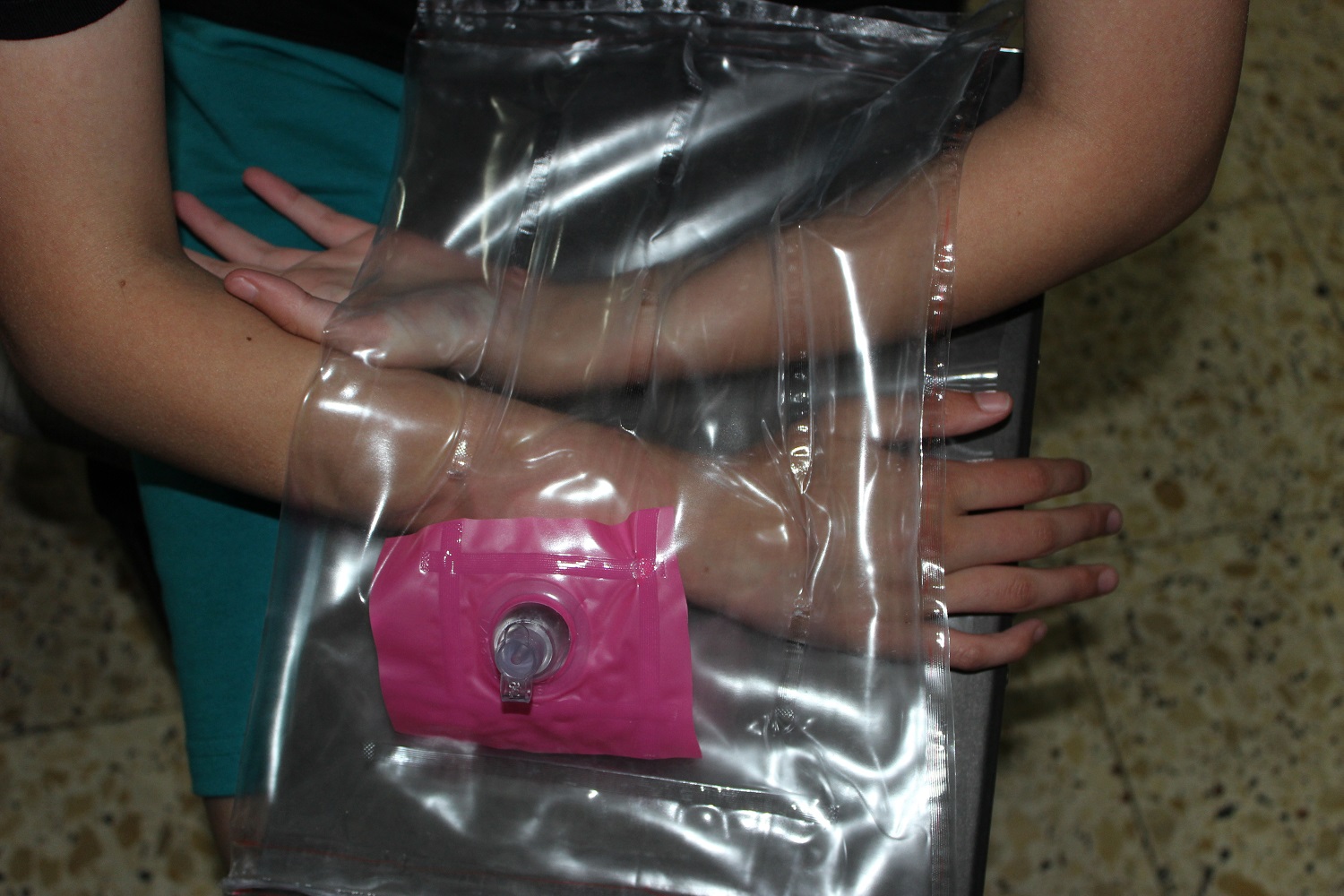
Standard binder with inflatable and portable shell.
Concentrating on breathing, and inhalation was proven as helping to lower the
level of stress and anxiety, and helps the body to relax.
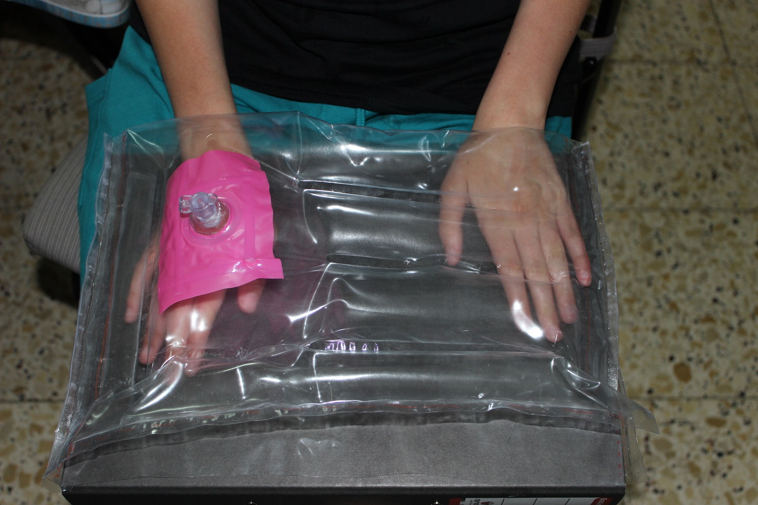
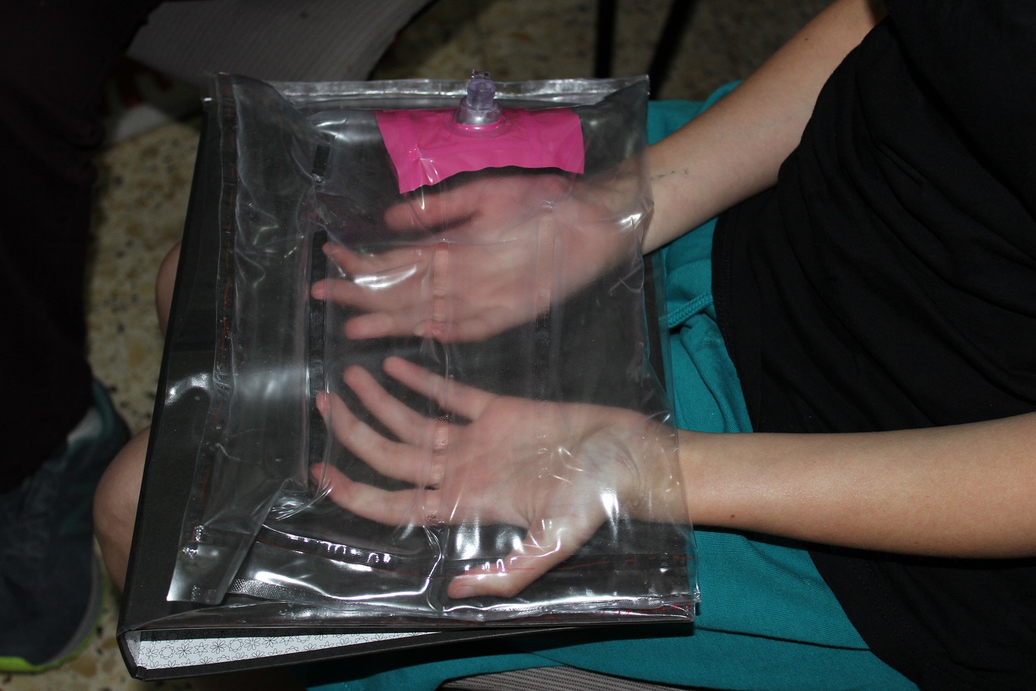
Another method of sedation is to insert the hand or arm into the pocket created
after inflating. The inflated part creates pressure and wraps the hand, like a good hug.
(Temple Grandin research)
Model #1 focused on:
The first attempts were with a notebook
with a paperback.
It didn’t hold the shape and folded as
I inflated the shell.
Therefore I switched to another
product with a hard shell
Proportions
Operation
Overall look and feel
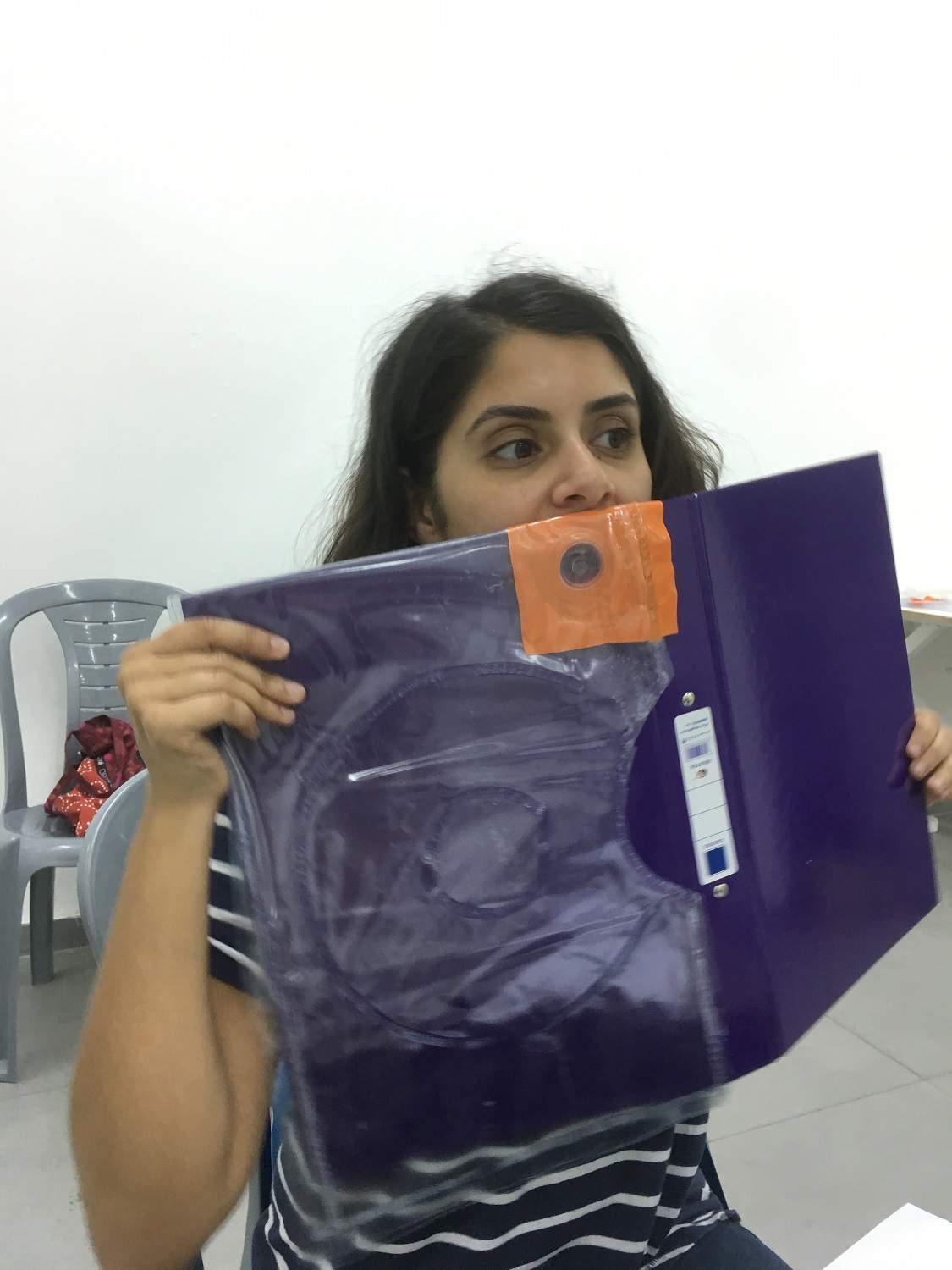
Model #2:
Precise – position of the nozzle
Start thinking of graphic and visual design
User testing:
The Goldstein family took me into their home and allowed me to observe their children using the products I have designed.
* Both their children were diagnosed with SPD
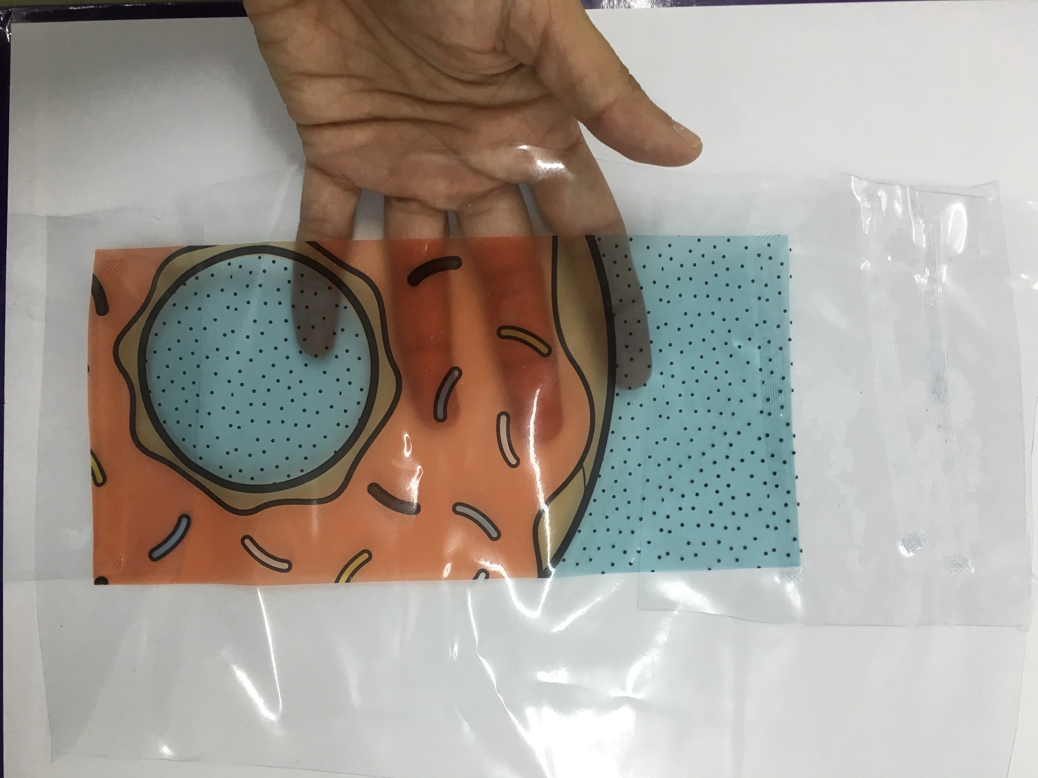
Working on details:
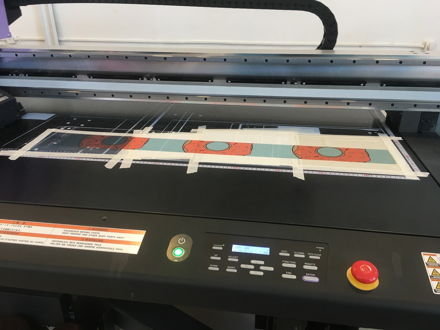
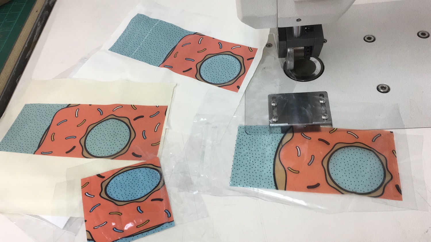
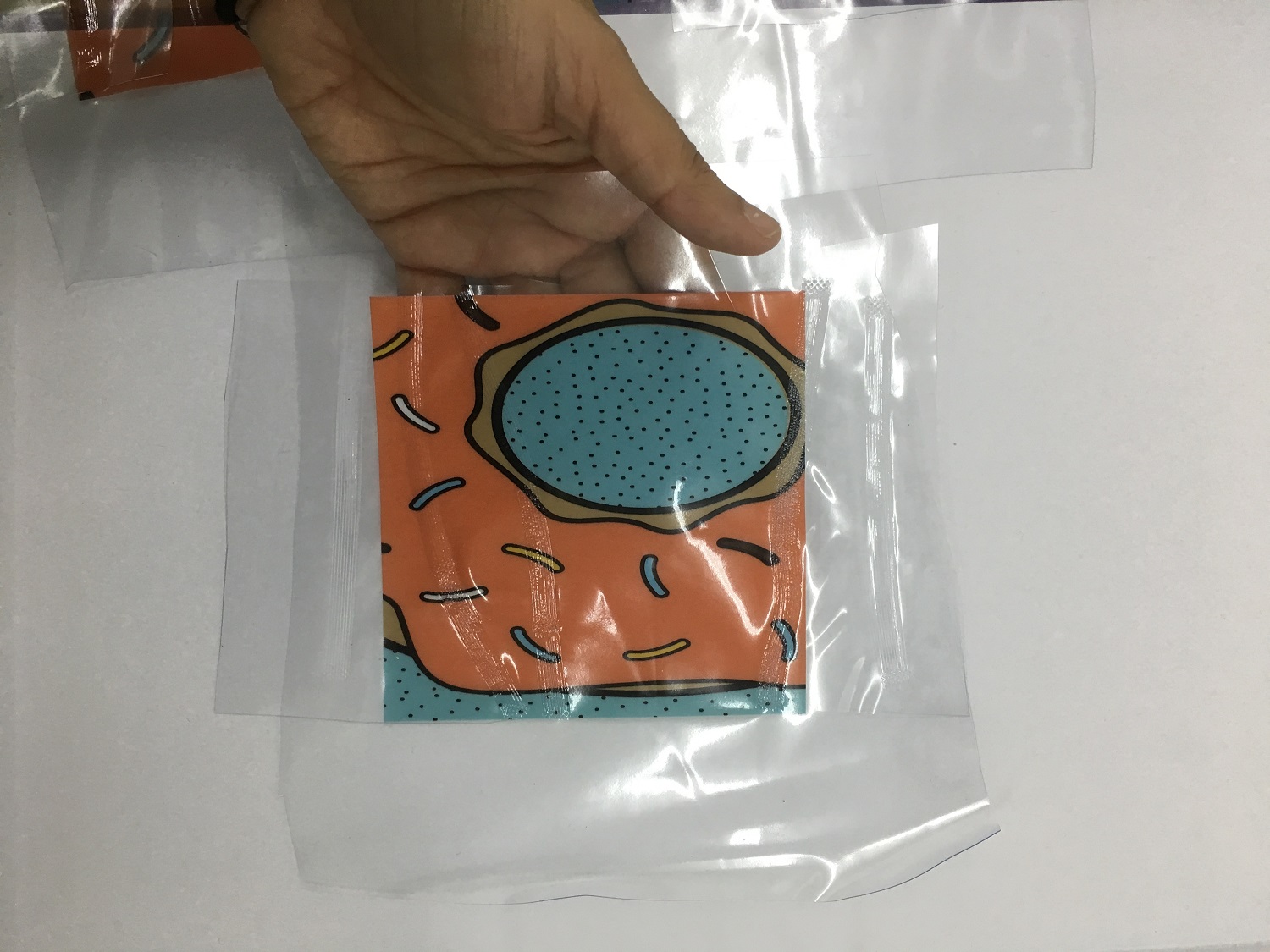
Material and printing testing
Drinking cup
A standard drinking cup made of metal.
The cup is wrapped in a silicone shell, besides the texture and
the pattern there are openings that allow direct touch with the
cup – if it contains a hot or cold drink, you can feel it immediately.
Model #1:
Researching the structure
of the cup
Checking optional location for textures and holding points.
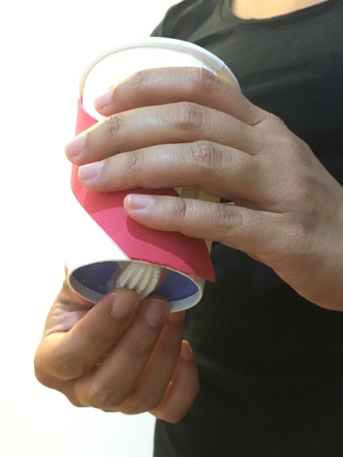
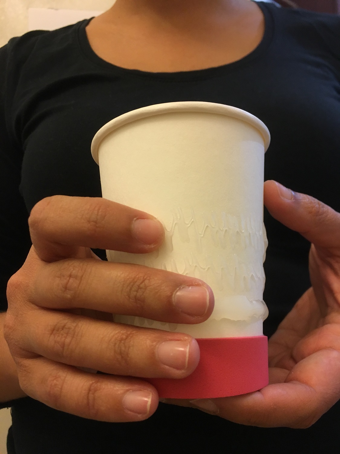
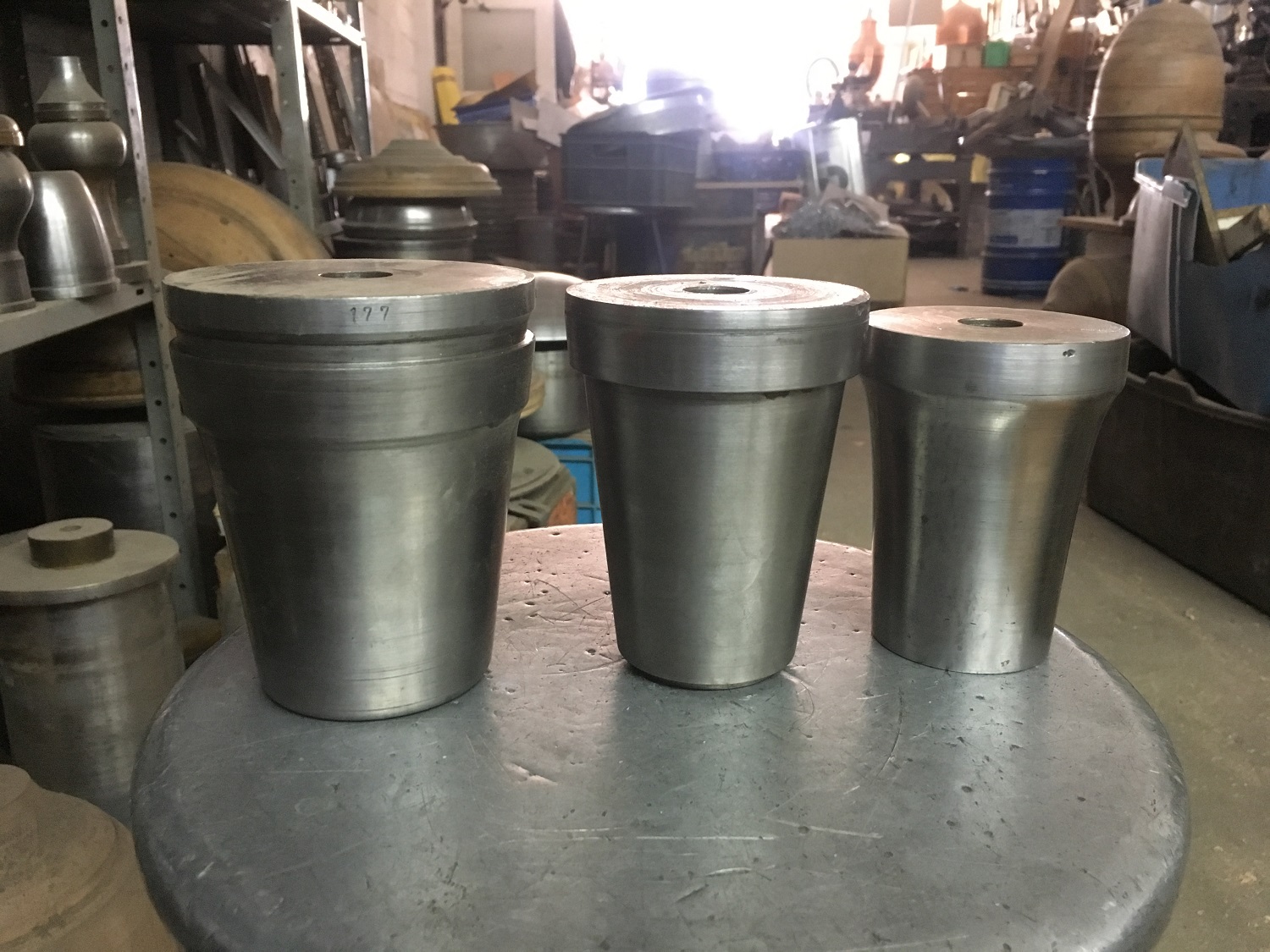
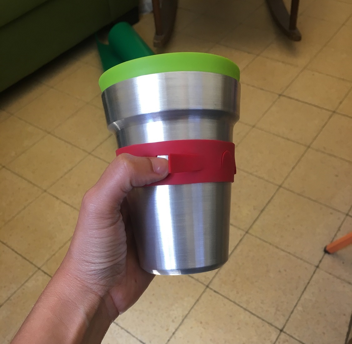
Examine the size and shape
Proportions
Overall look and feel
User testing:
The Goldstein family took me into their home and allowed me to observe their children using the products I have designed.
* Both their children were diagnosed with SPD
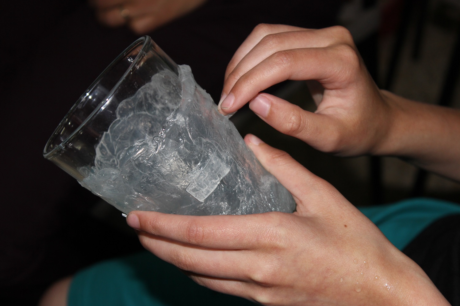
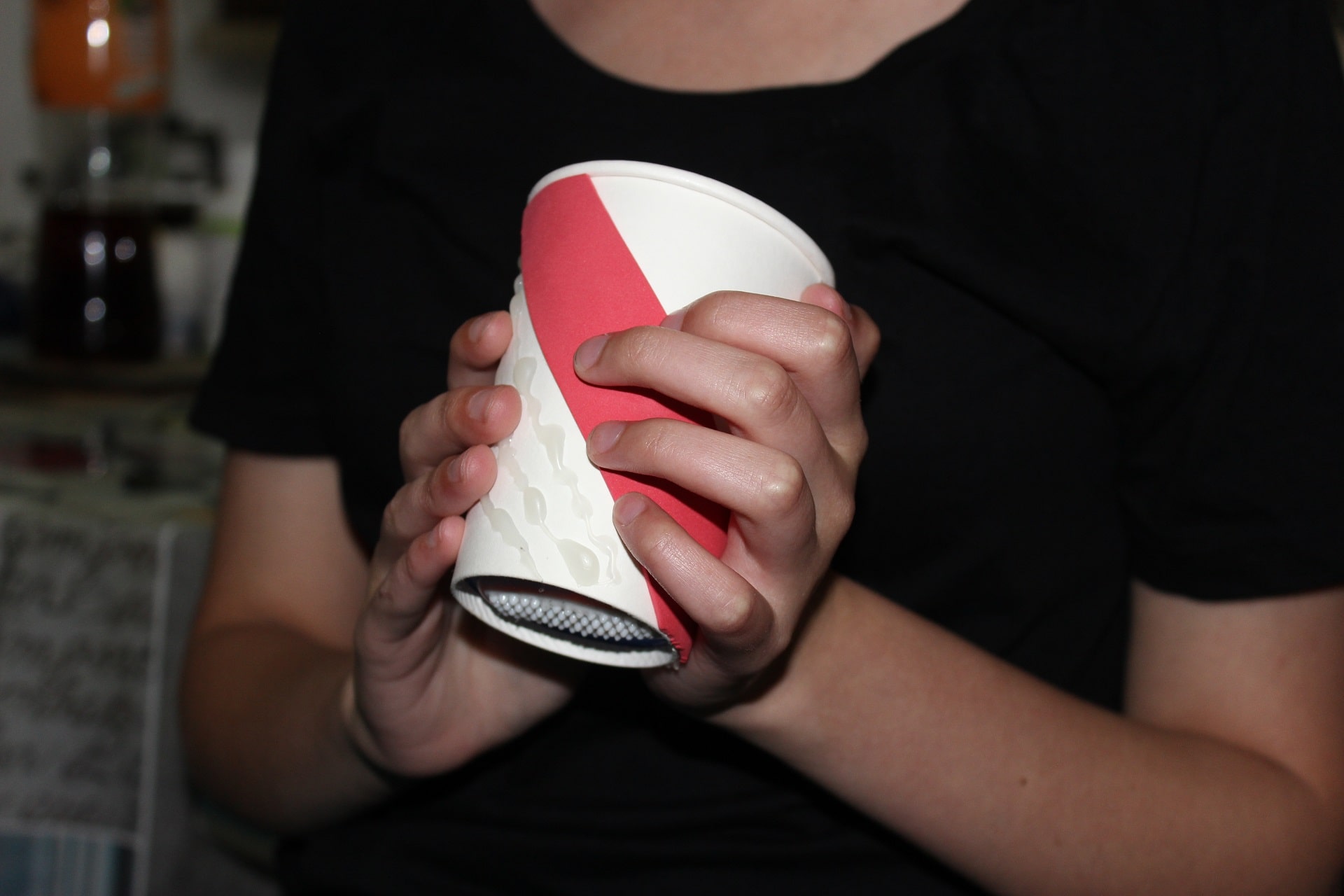


One of the reviews on this project was “I do not understand what you did here,
it looks completely bought”.
I’m not sure if he meant criticism or a compliment. I took it as a compliment
because one of my goals was to normalize the need for sensory stimulation,
and if to a bystander it looks like another everyday object, I did mine.
On the other hand, I think another round of testing and accuracy of some of
the elements would have created a better product. In the time I had,
it was the best product I could provide.
I am happy to raise awareness of the issue and would be even happier if
someone would feel more comfortable using the product in public.