LIGHT ENERGY is a smart home application,
enabling control and monitoring of all electrical devices
in a house environment through several platforms.
My Role
UI
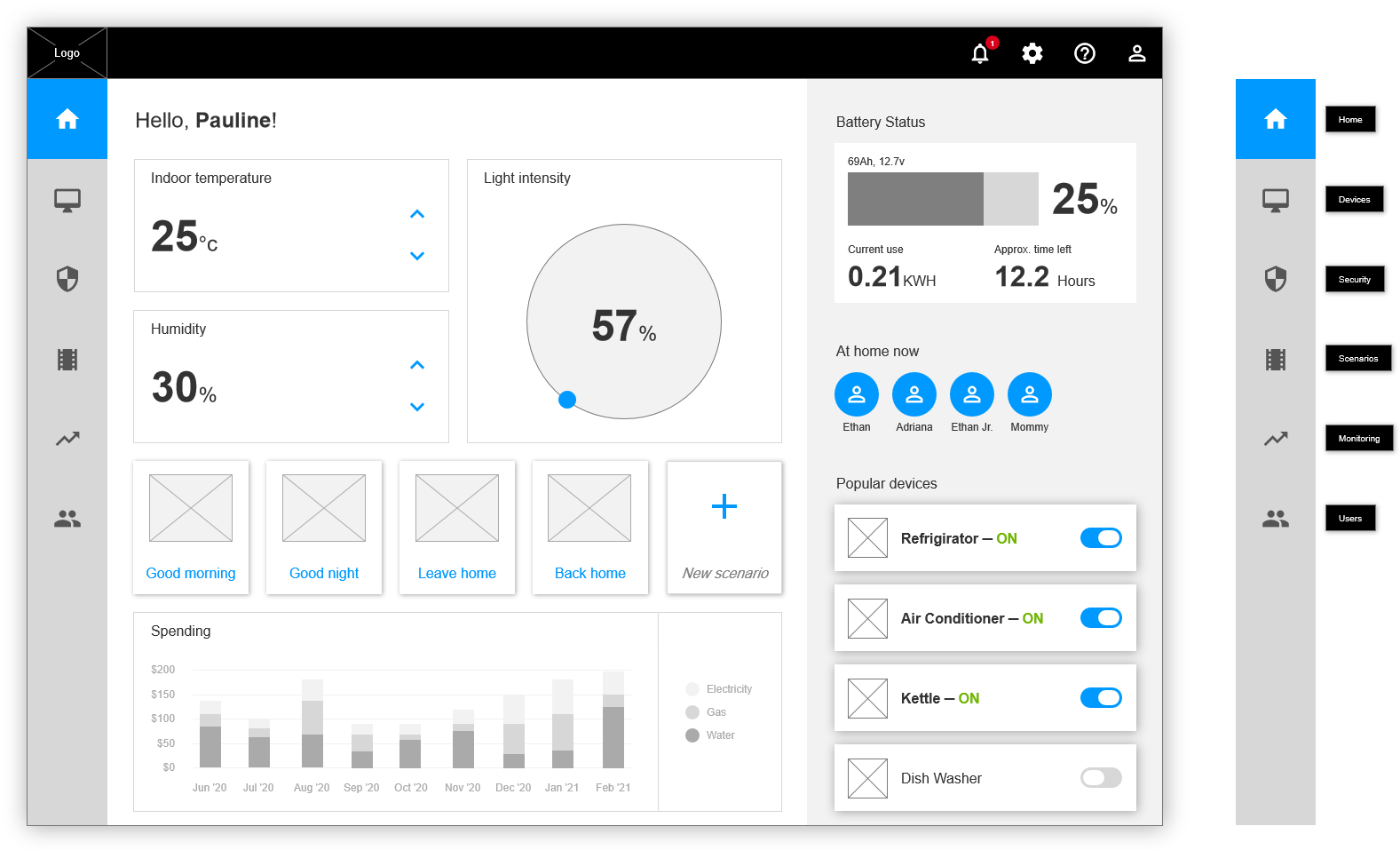
Design by given wireframes
clean and minimal UI approach

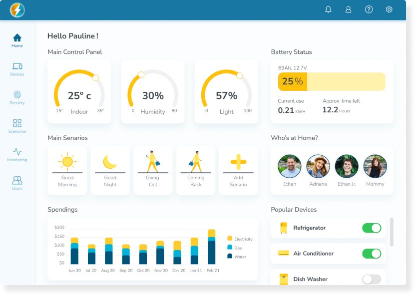

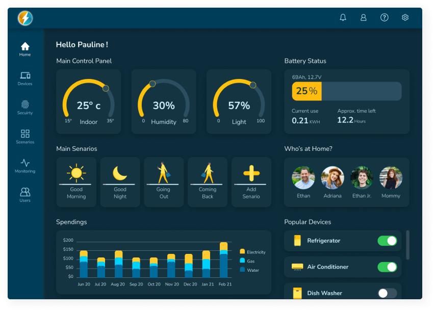
Process and Wireframes
Main control panel
At first, I rearrange the three main buttons to be equal by size, shape, and operation method.

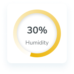
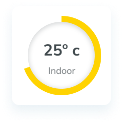
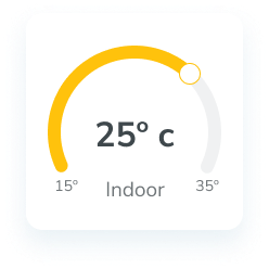
The Evolution of a feature
The first one designed with faded edges which made it difficult for the user to understand where the end was.
The second was designed with clear edges but still remains full circle, which makes it difficult to understand the scale, not every parameter is from 0 to 100.
The third and final designed like gauge element. It allows me to set a minimum and maximum range, for each parameter.
Main control panel
At first, I rearrange the three main buttons to be equal by size, shape, and operation method.
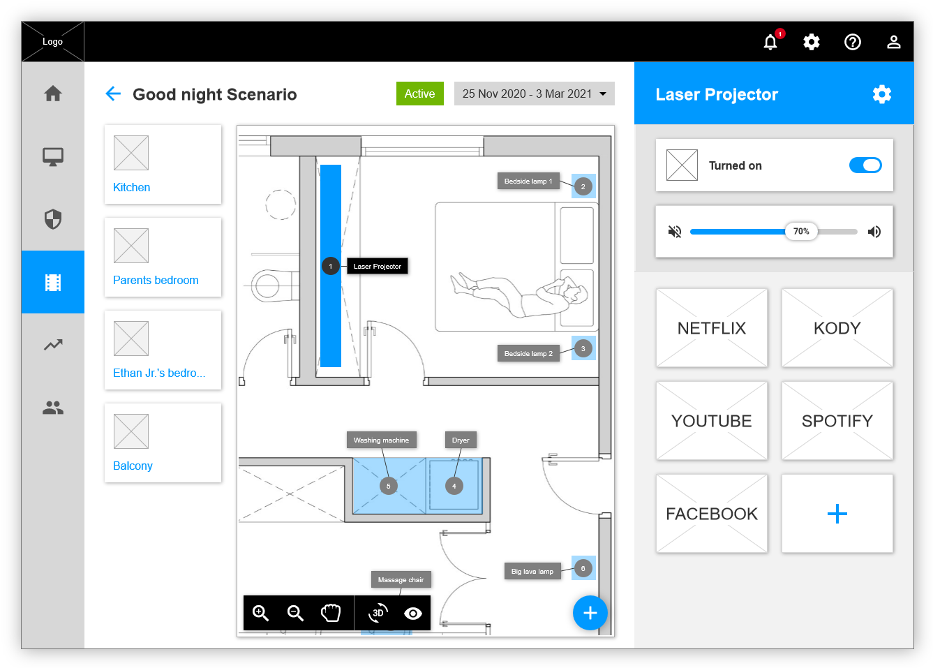
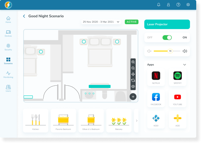
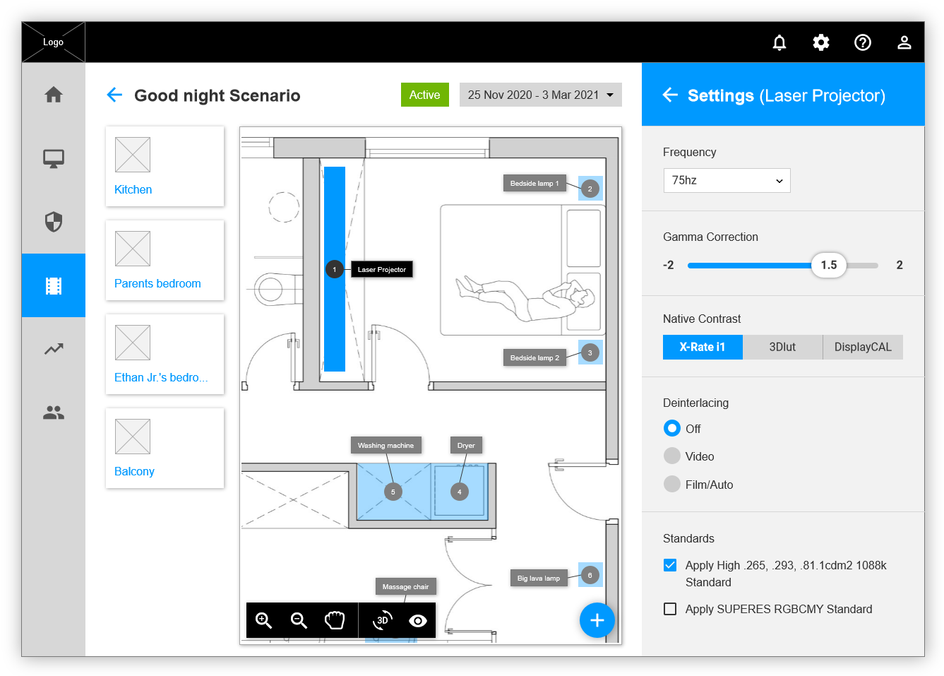
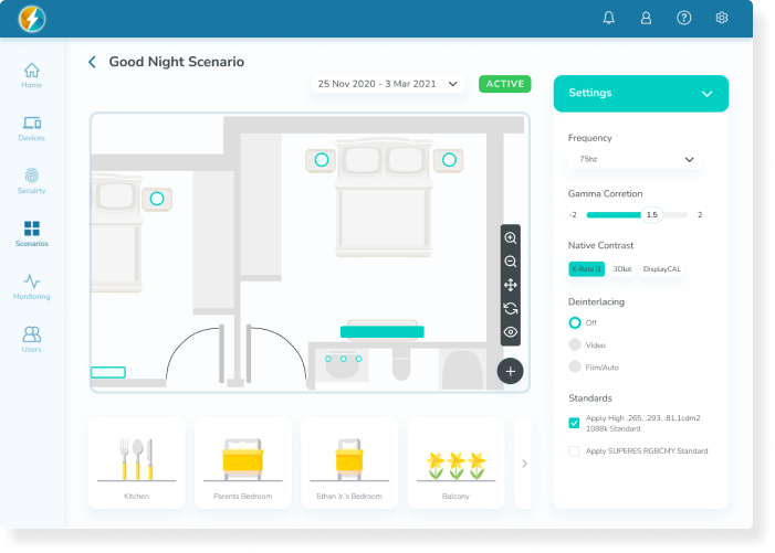
Scenario operation board – Settings
I decided to minimize the space was given to the setting bar, at the expense of a larger house map.
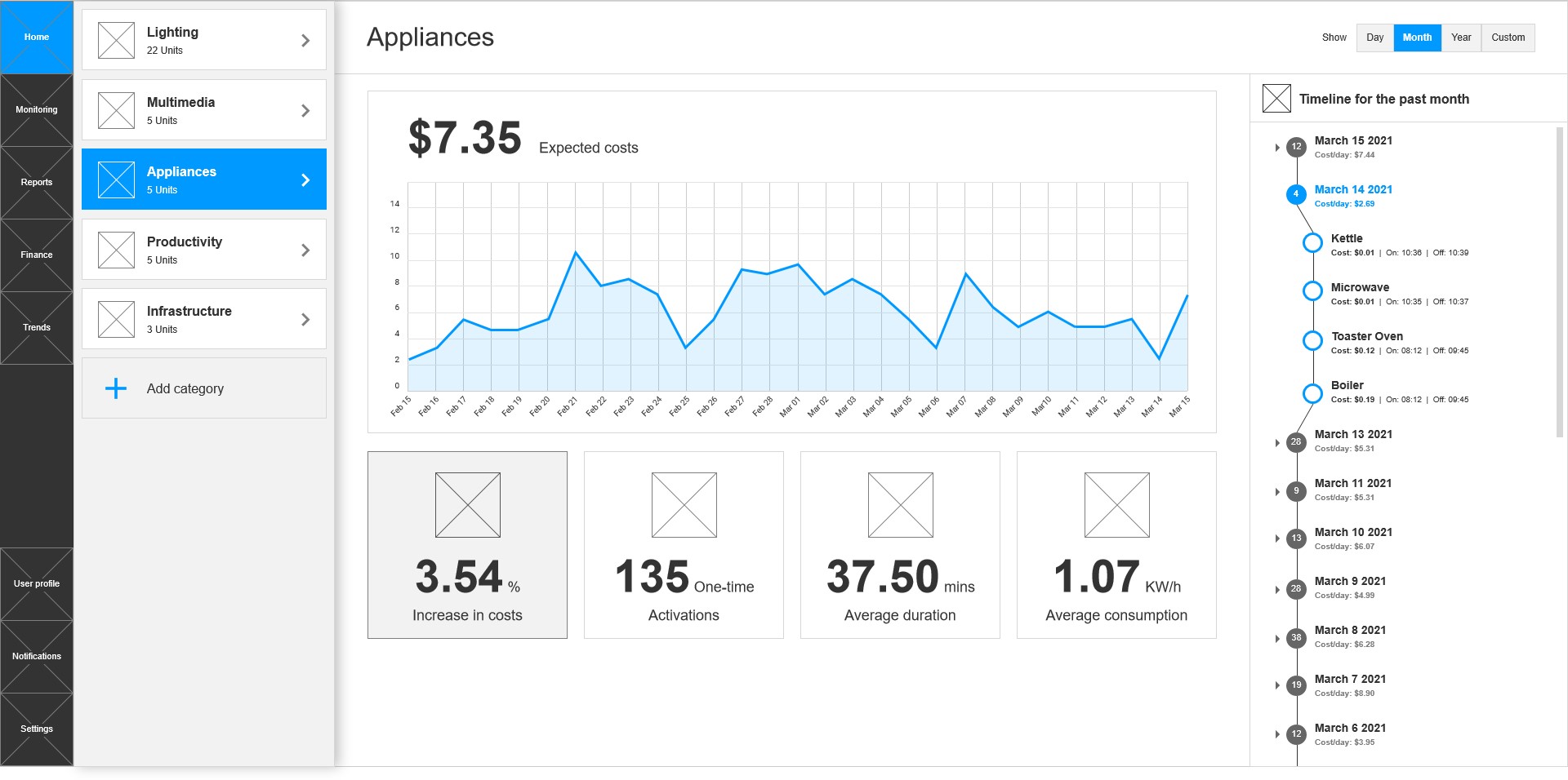
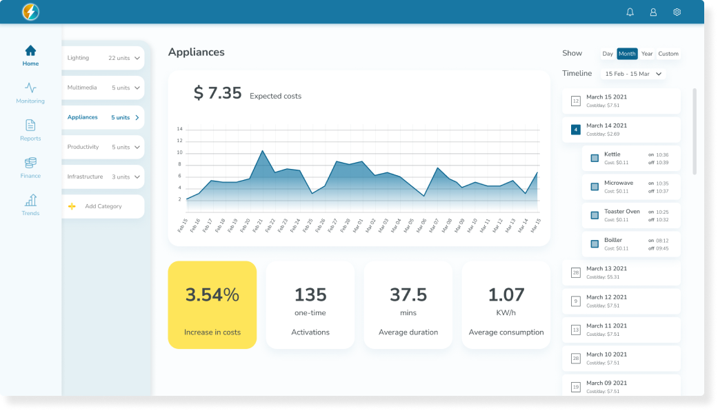
Desktop Dashboard
I added a top bar and rearrange the hierarchy between the side and top bars.


Icons and Graphic language
Desktop Dashboard

<span data-metadata=""><span data-buffer="">Typography
Based on brand typography
Calm and readable