Unified Portal

#Product Design

#SaaS

#B2B

The mission was to unify three products into a single, coherent portal
while maintaining functionality, improving usability, and reinforcing product value

Overview

Radware, a cybersecurity company, acquired 2 subsidiary companies.
The vision was to create a one-stop shop where the user has all the services they need in one place.
Based on these foundations, we set the visual language infrastructure
and established a design system from scratch.
This project was the cornerstone for an ongoing process planned for the next few years.

My Role & Responsibilities
  • Own features from idea to implementation
  • Research
  • Provide UX and UI solutions for complex configuration
  • Design and develop wireframes, prototypes, and pixel-perfect UIs
  • Collaborate seamlessly with cross-functional teams throughout the project lifecycle

Challenge

The fragmented structure of the existing services created disconnected experiences, overwhelming users with multiple platforms, inconsistent interfaces, and unclear navigation in and between the different services.

Our starting point for the design process was these three services.
As you can see, each service uses a different visual and graphic approach.

Portal #1
Portal #2
Portal #3

To address this challenge, we developed a strategy centered on creating a unified visual design language as a first step.

The first step involved thoroughly analyzing all visual design elements across the three services to identify commonalities and discrepancies.

New Visual Identity

UI components mapping reveals a critical challenge, inconsistencies in UI elements across the products.
For example, buttons and toggles, as you can see below.

Buttons
Toggles

With a full rewrite off the table due to extensive legacy code, we took a smarter route:
New and unified visual identity.

We modernized the look, kept the experience seamless, and protected the value of existing systems,
all while moving faster toward a unified, user-first platform.

Design System Elements

Created a Design System

We established standardized color palettes, typography, layouts, and UI components to create a cohesive and intuitive user experience.

Infrastructure & Foundation

This step established the UI infrastructure that shapes the portal’s visual identity today and continues to evolve.

The unification journey is still in motion, powered by the design system and principles we set in place to scale and adapt for the future.

User-Focused Approach

This merging created an opportunity to reimagine the user experience across key functionalities.
Following the consolidation, we introduced unified features designed to enhance user interaction,
streamline workflows, and improve overall efficiency.

Here are some examples:

Side-by-Side Configuration

For complex systems with large datasets, the side-by-side configuration offers a seamless solution.
Users can access a side panel within the same screen, eliminating the need for additional navigation and allowing them to configure settings while viewing the main content.
This approach streamlines workflows and enhances the user experience by enabling simultaneous interaction.

Step #1 - Select Service
Step #2 - Select type
Step #3 - Select entity + fill relevant properties
Full Form

Data-Driven Insights

The new platform enabled the design of innovative dashboards that leverage advanced data visualization techniques to present security metrics and trends clearly and concisely.

This empowers users to navigate large volumes of data effortlessly, uncover valuable insights, and make informed decisions to proactively mitigate risks.

Dashboard

Product Visibility

The unified portal introduces a modern, transparent approach to product visibility.
Unlike previous versions, it presents the full range of available features, including those outside the user’s current subscription, offering complete clarity into the platform’s capabilities.

This empowers users to explore the full scope of cybersecurity solutions and tailor their subscriptions as their needs and preferences evolve.

Enhanced visibility also delivers significant business value.

It drives cross-selling opportunities, supports targeted marketing efforts, and strengthens the sales pipeline, ultimately opening new revenue streams and aligning more closely with customer demands.

Out of Plan
Add-On
Empty State
Dark Mode Theme

Dark Mode

We also implemented dark mode, to address user demand and enhance long-term usability.
This addition reduces visual fatigue, and strengthens the portal’s alignment with current UI best practices.

Impact

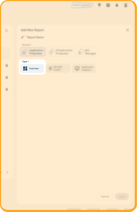
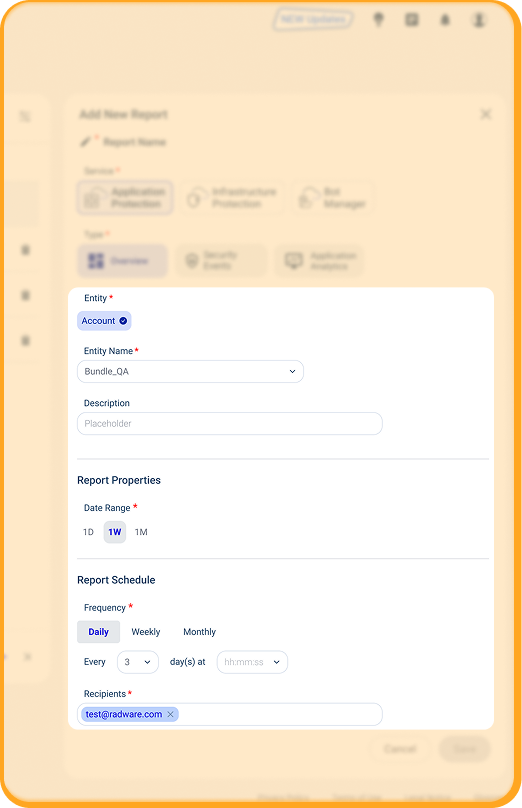
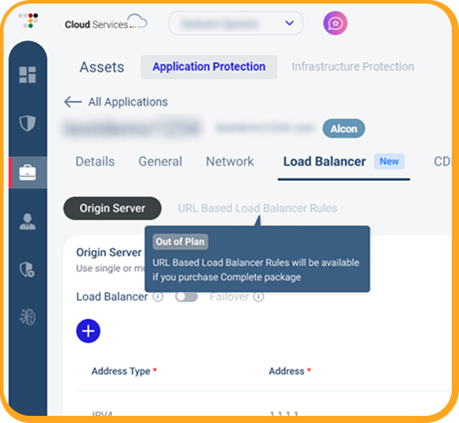
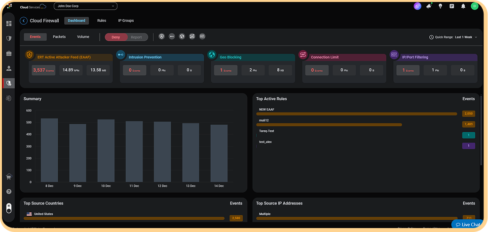
This project demonstrates how establishing a new visual identity combined with a user-centered approach can create far-reaching impact beyond aesthetics.

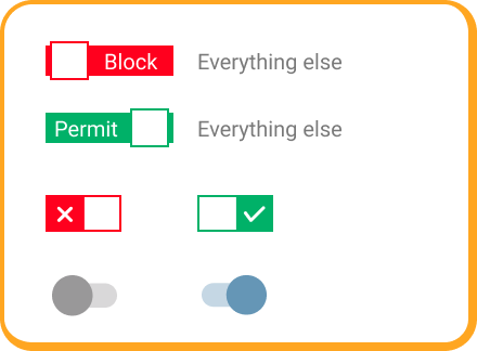
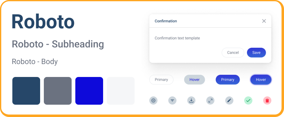
Through thorough mapping of UI components and the establishment of consistent design principles,
a strong design foundation was created.
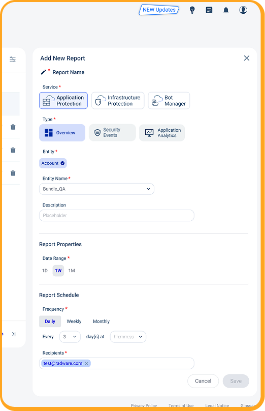
The result:
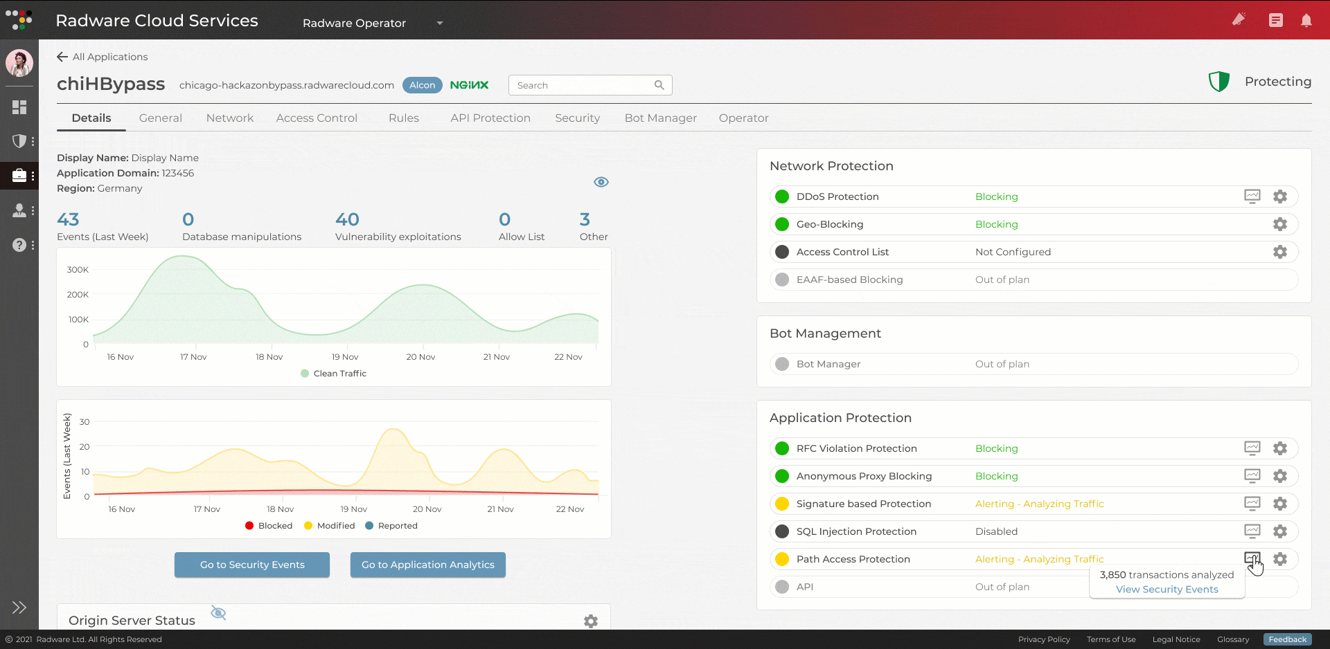
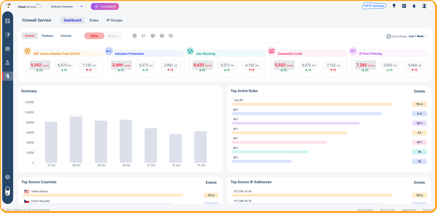
A cohesive, clear, and powerful interface that reinforces brand identity while significantly improving user experience across products.

By aligning the design with the company’s business goals, the new visual system not only elevates usability it also supports customer retention, encourages product exploration, and ultimately drives growth by attracting new users and increasing revenue.

Thank you

Accessibility Toolbar